
ZIGU is a widget-based link-in-bio tool developed by EarthMera, designed to help users curate and organize sustainability-related content, social links, and action-driven resources in one flexible interface.

BEFORE

AFTER
>
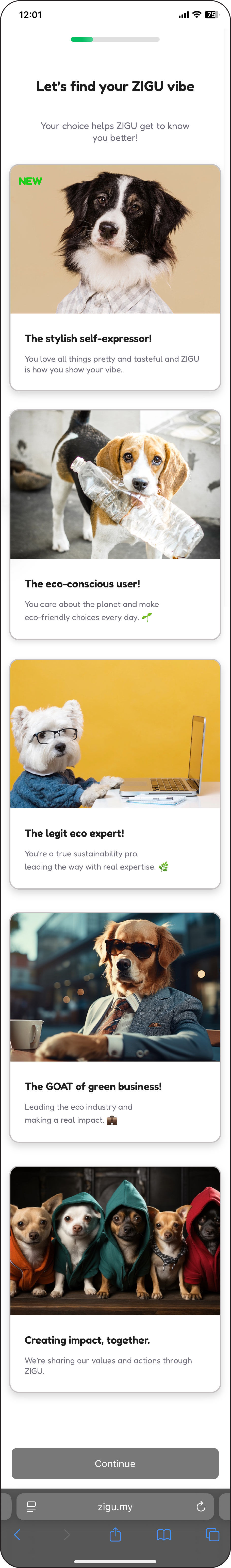
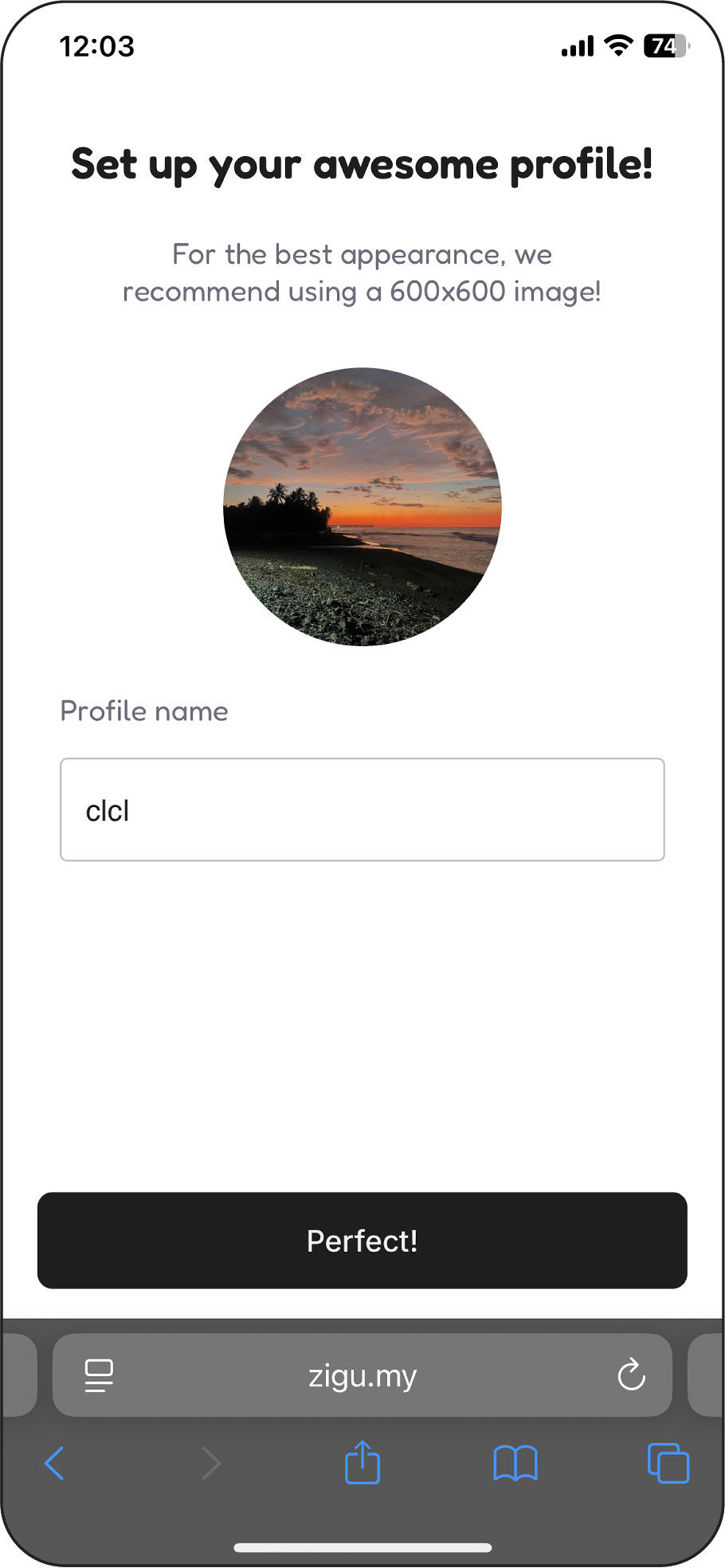
• Onboarding frames the experience as personality-driven
→ However, templates lack meaningful differentiation
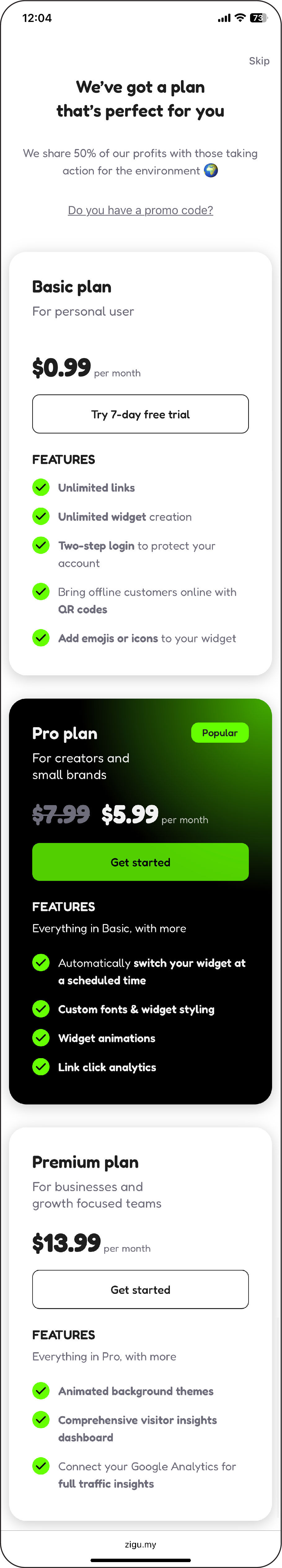
• Trial CTA does not respond during onboarding
→ Breaks trust and disrupts the user’s mental model early
• Visual hierarchy and text sizes are relatively small
→ Reduces readability and scannability during onboarding
• Onboarding sets expressive expectations that the system doesn’t sustain
• Customization introduces cognitive load without clear differentiation
• Template structures lack meaningful variation to reflect brand identity
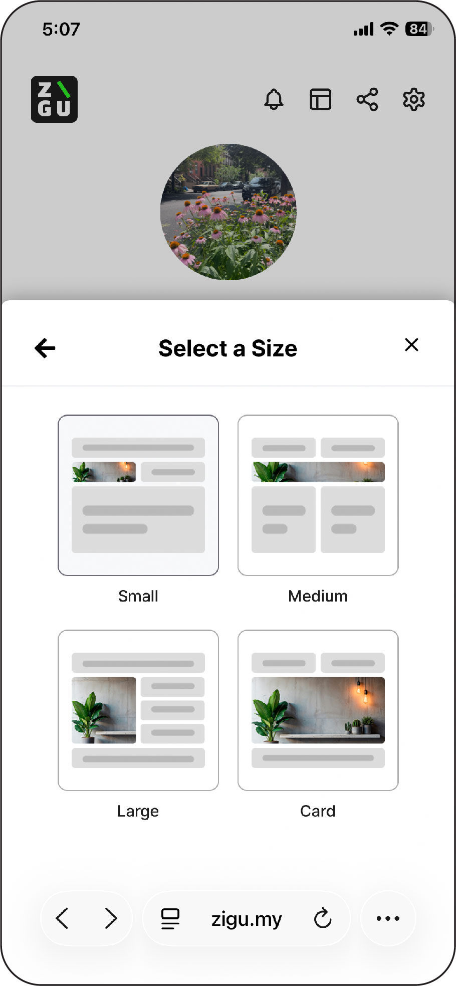
• Editing interactions lack spatial efficiency, making rapid iteration difficult
• Empty space is positioned as a visual flaw rather than a flexible user choice
Key Findings
Early-Stage UX Evaluation & Heuristic Analysis
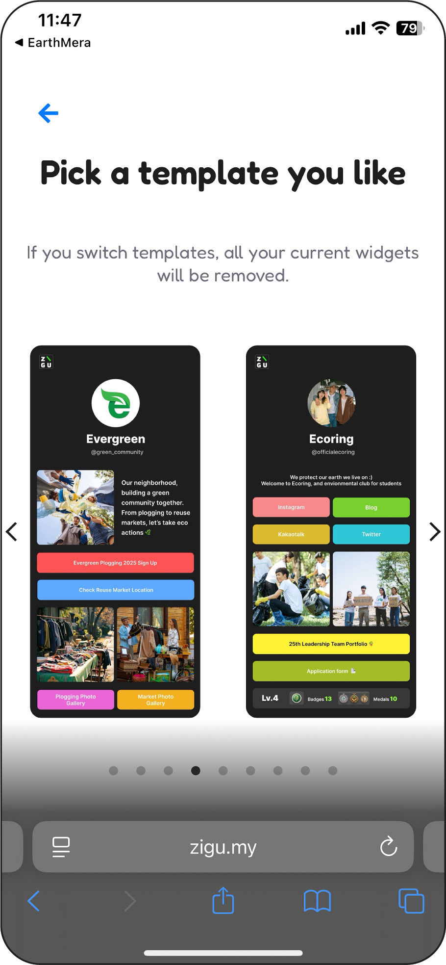
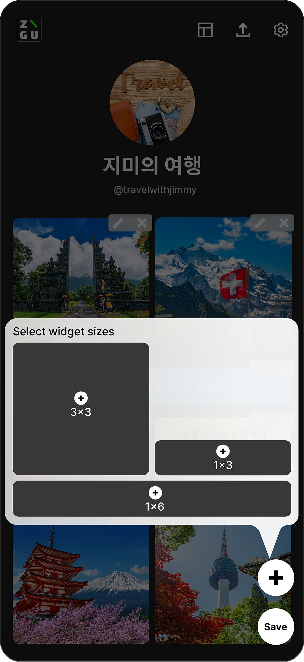
• Templates rely on identical structures and a black-only background
→ Limits visual differentiation across templates
• Typography, layout, and components lack variation
→ Content feels generic and interchangeable
• The eco-focused brand narrative does not translate at the system level
→ Sustainability reads as surface messaging rather than core identity
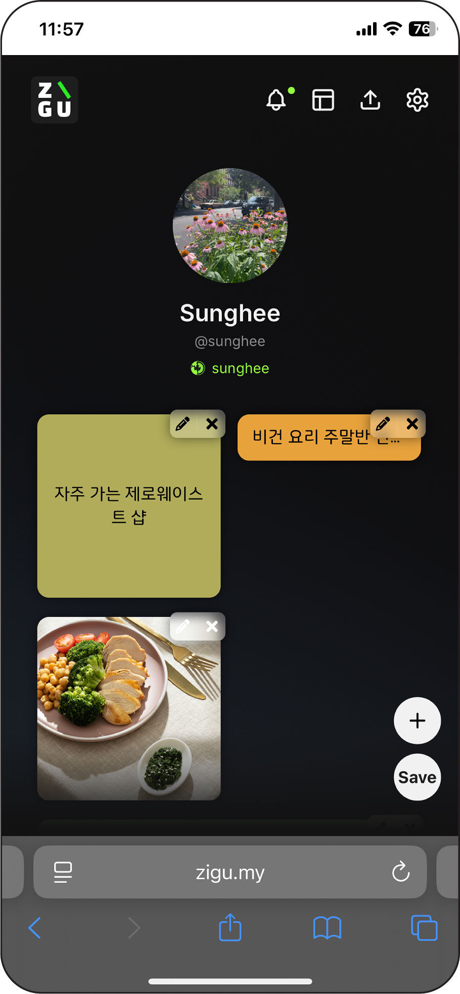
• Edit and delete controls are small and tightly placed
→ Increases the risk of accidental actions during editing
• IDs are stacked vertically with inconsistent font sizes
→ Wastes vertical space and obscures identity hierarchy
• Excessive empty space at the bottom of the screen
→ Creates visual imbalance and reduces content focus
Team Concern: Scheduled widgets disappearing could create empty gaps, potentially affecting visual consistency.
UX Rationale: Empty space is not inherently a usability issue. Auto-filling gaps adds complexity and can create unpredictable layout shifts. Preserving a stable layout with user-controlled adjustments maintains clarity and flexibility.
Reframing Widget Scheduler
Competitive Analysis: Scheduling Model
Collaborative Iteration: Scheduler Flow
Reviewed scheduling patterns from Linktree, Instagram, and other content platforms to evaluate different interaction models.
Calendar-based systems support long-term planning, while wheel-based selectors enable near-term action.
The initial widget creation flow combined content selection, sizing, scheduling, and customization into a single process, making it difficult for users to build a clear mental model of how widgets worked.
• Moved widget size selection to the beginning of the flow
→ Established structure before asking users to define content
• Reframed scheduling as a behavior setting, not a content type
→ Clarified the distinction between structure and behavior
• Removed scheduling from the primary content menu
→ Reduced conceptual confusion
• Proposed a wheel-based scheduler
→ Simplified near-term scheduling decisions
• Reduced and clarified customization options
→ Prioritized clarity and learnability over excessive flexibility
Problem
Design Suggestions


Editing Experience
Template System Limitation
Onboarding & Initial Experience


CALENDAR-BASED
WHEEL-BASED

• Conducted UX audit identifying structural and scalability gaps
• Restructured the widget creation flow to improve clarity and coherence
• Improved hierarchy and template structure for diverse campaign use cases
• Built a system that supports growth without increasing design complexity
ZIGU reinforced the importance of system thinking in interface design. Scalability is not about adding features, but about designing clear structures that align with the brand as complexity grows.
Impact & Reflection
