


Designing a Clearer Path to Eco-Action with EarthMera
EarthMera is an eco-action platform that enables users to complete sustainability missions, verify actions through AI, and earn rewards within a community-driven system.
I partnered closely with the CEO and engineers during the early product stage to evaluate usability and structural gaps, clarify core user flows, and design UI components that improved focus, consistency, and action clarity across the experience.
Early-Stage UX Evaluation & Heuristic Analysis


Key Findings
• Typography lacked hierarchy and consistency, making it difficult to scan and prioritize information.
• UI elements (buttons, icons, colors) were not systemized, weakening brand trust and visual cohesion.
• Several screens lacked contextual guidance and supporting copy, leaving users unsure of what to do next.
• The information architecture prioritized features over user flow, resulting in fragmented navigation and unclear next steps.
• Heavy reliance on a character-centric UI risked positioning the product as a game rather than a credible sustainability platform.
• Bottom navigation icons were ambiguous and required clearer labeling.
• Overall, the visual direction lacked emotional grounding and credibility for an environmental mission-driven product.
From Character-Driven to Action-Driven
BEFORE


AFTER

Problem
The home experience prioritized character interaction and manual check-ins, which diluted EarthMera’s core value: enabling quick, meaningful eco-actions.
>
Design Suggestions
I proposed shifting the experience toward:
• Automatic check-ins
• Action-first content
• Clear CO₂ impact visibility
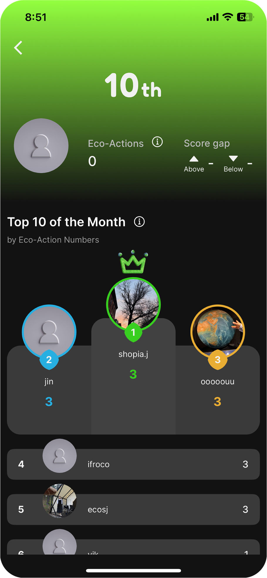
Expanding Toward Community: Forum Feature Concept
A newly proposed feature to shift the product from a character-driven experience toward a community-driven platform, enabling users to connect, share, and engage with each other more meaningfully.
Competitive Analysis
I reviewed a range of forum models—from one-way help desks and Q&A boards to open, multi-directional discussion platforms like Reddit—to understand how structure impacts participation and content quality.

Q&A BOARDS


MULTI-DIRECTIONAL DISCUSSION

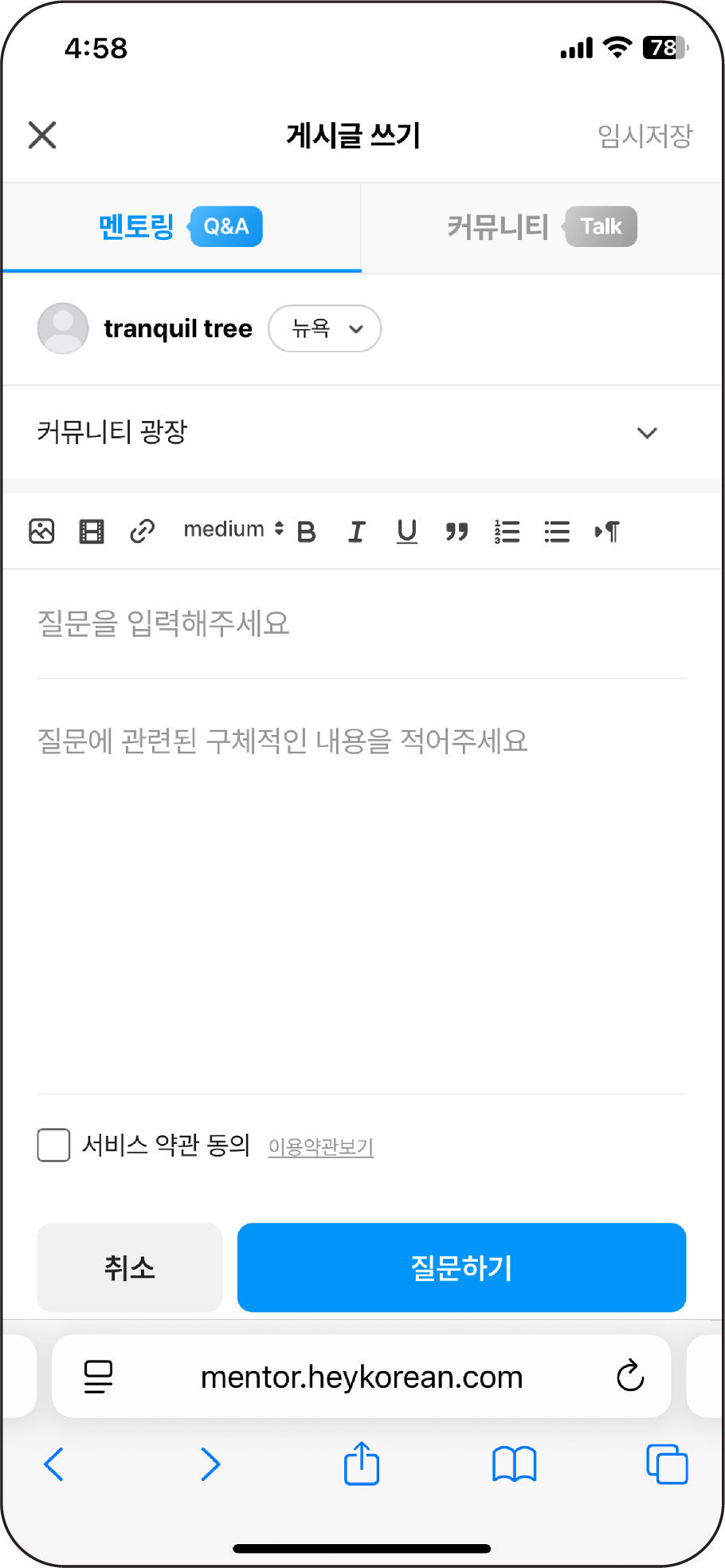
Designing Forum Section
Instead of limiting conversations to rigid Q&A formats, I proposed a flexible, feed-based discussion model that encourages peer-to-peer interaction and repeated participation.

Collaborative Iteration & UX Recommendations for Stronger Engagement

FORUM ENTRY & PROFILE
• Refined information architecture
The top-level tab was labeled Post but led into another Post view.
→ Renamed the top-level Post to Feed or Community to reduce confusion and clarify where boards live.
• Strengthened visual hierarchy
Forum titles lacked prominence, making the page feel secondary.
→ Increased title scale to establish clearer hierarchy.
• Reduced content overload
Fully expanded posts led to excessive scrolling.
→ Limited main posts to 2–3 lines and previewed 1–2 top comments to encourage participation.
•Surfaced activity signals
Users couldn’t easily tell which boards were active.
→ Added post counts and engagement indicators to guide participation.
• Improved media visibility
Photos were hidden behind post entry, reducing engagement.
→ Allowed images to appear directly in the feed.
• Encouraged participation with prompts
Users lacked cues for starting conversations.
→ Introduced example prompts:
“What small eco-action did you take this week?”
• Introduced engagement-based rewards
Forum participation lacked incentive.
→ Implemented level progression based on posts, comments, and likes.

FORUM DISCOVERY

CONTRIBUTION FLOW
• Reframed the product structure around core user flows rather than isolated features
• Improved clarity and navigation by simplifying information architecture
• Strengthened visual hierarchy to increase credibility and usability
• Shifted the product tone from game-like to a more mission-driven sustainability platform
Throughout this project, I kept returning to the core of the product — making participation simple, visible, and sustainable. I reduced noise, clarified hierarchy, and shaped the experience around action rather than decoration.
Impact & Reflection
