

Ticketeer is an eco-action event app developed by EarthMera for the UKIS 2025 event, designed to support sustainability-focused participation within a live event environment.

User Story
As a conference participant, I want to quickly check in, explore booths, complete eco missions, track my progress, and redeem rewards, so I can contribute to sustainability while fully participating in the event.
Event Constraints
Designed for a live, high-traffic conference environment where attention is fragmented and decisions happen in seconds. The experience had to function within real-world limitations:
• Minimal onboarding tolerance
Users expect immediate access upon arrival
• Compressed decision windows
Navigation must support fast scanning, not deep browsing
• Physical–digital coordination
QR scans, booth visits, and reward validation must sync instantly
• Inconsistent QR placement
Scanning needed to work in variable lighting and positioning
• On-site reward confirmation
Completion had to be clearly validated by both system and staff
User Journey
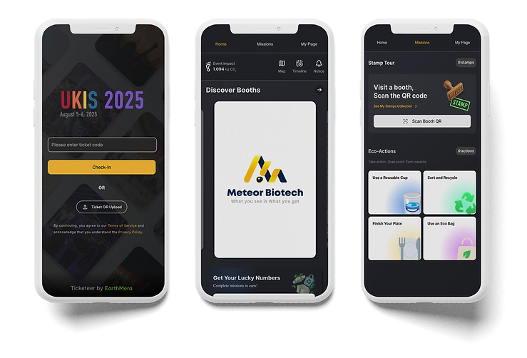
1) Arrive & Check In
• Scan QR code for instant entry
• Skip lengthy onboarding
• Start participating immediately
Frictionless entry in high-traffic context
>
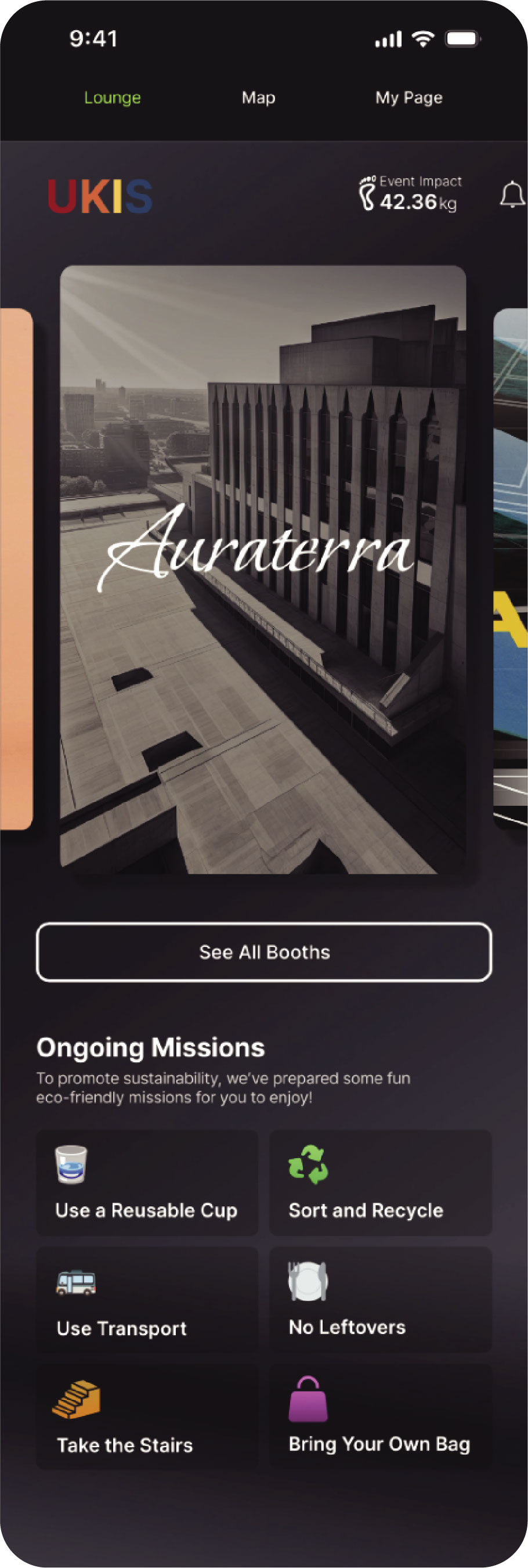
2) Explore Booths
• Browse booth list or map
• Quickly decide where to go
• Understand event structure at a glance
Clear hierarchy over feature overload
>
3) Engage with Booths
• Visit booths and learn about companies
• Scan QR codes to earn stamps
• Track progress toward rewards
Seamless physical + digital sync
4) Complete Eco Missions
5) Redeem Rewards
>
• Participate in eco actions on-site
• Track mission progress and rewards
• View measurable environmental impact
>
• Review collected stamps and rewards
• Validate completion via staff scan
• Receive physical prize
Visible impact sustains engagement
Tangible sense of closure
Early-Stage UX Evaluation & Heuristic Analysis


Key Findings
• The interface lacked clear hierarchy, making it difficult to scan and prioritize actions in a fast-paced event environment.
• Booth discovery and eco-missions were merged into one layer rather than separate primary menus, increasing cognitive load.
• Map access functioned as a standalone menu item rather than a contextual tool within booth exploration.
• Several screens lacked contextual guidance, leaving users unsure of what to do next.
• Visual inconsistencies reduced clarity and weakened confidence in key actions.
Reshaping the Structure to Reflect On-Site Event Flow
Streamlining Event Check-in

BEFORE

AFTER
>
Clarifying Booth Discovery & Mission Flow

BEFORE

AFTER

Problem
Booth discovery and eco-mission tasks were grouped under an ambiguous “Lounge” label, making it difficult for attendees to quickly understand where to explore booths versus where to take action during the event flow.
>
Design Suggestions
• Separated booth discovery and mission actions into two purpose-driven pages
• Renamed and restructured navigation to reflect real on-site attendee behavior
• Integrated the Map within Booth discovery to strengthen vendor-to-location continuity
Impact & Reflection
• Restructured information architecture for faster on-site comprehension
• Reduced cognitive load by separating exploration and mission tasks
• Clarified the relationship between event flow, mission flow, and reward system
• Enabled faster, more confident decision-making in time-sensitive contexts
Ticketeer sharpened my ability to design for in-person event environments, where clarity in structure matters more than adding features, and small shifts in hierarchy meaningfully influence user confidence and action.
Problem
The event check-in flow relied on manual code entry, creating unnecessary friction at arrival and slowing down the first on-site interaction in a time-sensitive environment.
Design Suggestion
• Introduced QR upload on the sign-in screen to speed up check-in
